

Lesson 1 of 119 min video10 question quiz
Build a Focus and Talent report with Visual SQL
A nineteen-minute lesson that builds one report in Atlassian Analytics from an empty chart: the open role rate of every at-risk focus area, from Focus and Talent data, without writing SQL. On the way it explains the Data Lake, who a connection lets see what, aggregation, joins, formulas, both kinds of filter and which chart fits which question.

- Level
- Beginner
- Products
- Atlassian Analytics, Focus, Talent
- Format
- On demand, free, no sign-up
This is the lesson written out as reference. Each section below is one chapter of the video, in the same order, with the moment to watch and a frame from it. The video shows each step being done; this page is what to come back to when you are doing it yourself.
Where the data comes from
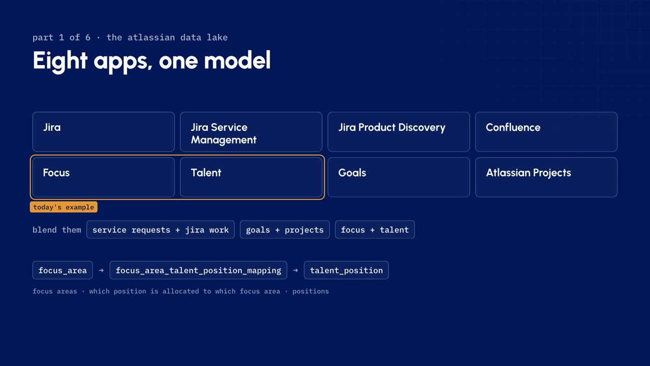
Every chart in Atlassian Analytics reads from a data source. For Atlassian apps, that source is the Atlassian Data Lake: one central database of your organization's app data, already modeled into tables and columns. There are no exports and no pipelines to build. You connect to it and you query it. If your data team wants the same model in its own platform, data shares let them extract it.
The Data Lake covers eight apps: Jira, Jira Service Management, Jira Product Discovery, Confluence, Focus, Talent, Goals and Atlassian Projects. Because they share one model, one chart can blend them:
- service requests beside Jira work
- goals beside the projects behind them
- Focus beside Talent, which is this lesson's example
In this example, Focus brings the focus areas, Talent brings the positions, and a mapping table records which positions are allocated to which focus area.
Watch out. The Data Lake is not real time. Changes arrive with its refresh: on the demo site, Talent changes appeared after the overnight refresh.
What a connection can see
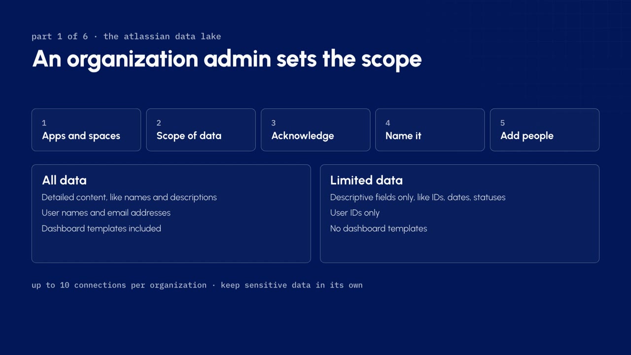
A connection decides what Analytics can see. Only an organization admin can create or edit one. To create a connection:
- Pick the apps and sites it reads, and include or exclude specific spaces.
- Pick the scope of data.
- Acknowledge the permission difference, explained in the next section.
- Name the connection.
- Add the people who can use it.
| Scope | What it includes |
|---|---|
| All data | Detailed content such as names and descriptions, user names and email addresses, and the dashboard templates |
| Limited data | Descriptive fields and user IDs only. No dashboard templates |
An organization can have up to ten connections, so sensitive data can sit in a connection of its own with a smaller audience. Access is then set per connection, at two levels:
| Action | Can query | Can manage |
|---|---|---|
| Create charts | Yes | Yes |
| View the schema and the query log | Yes | Yes |
| Grant or revoke access | No | Yes |
| Sync and edit the schema | No | Yes |
| Disconnect the source | No | Yes |
Watch out. A connection that selects specific spaces does not pick up new spaces on its own. They stay out until someone edits the connection.
Permissions do not carry over
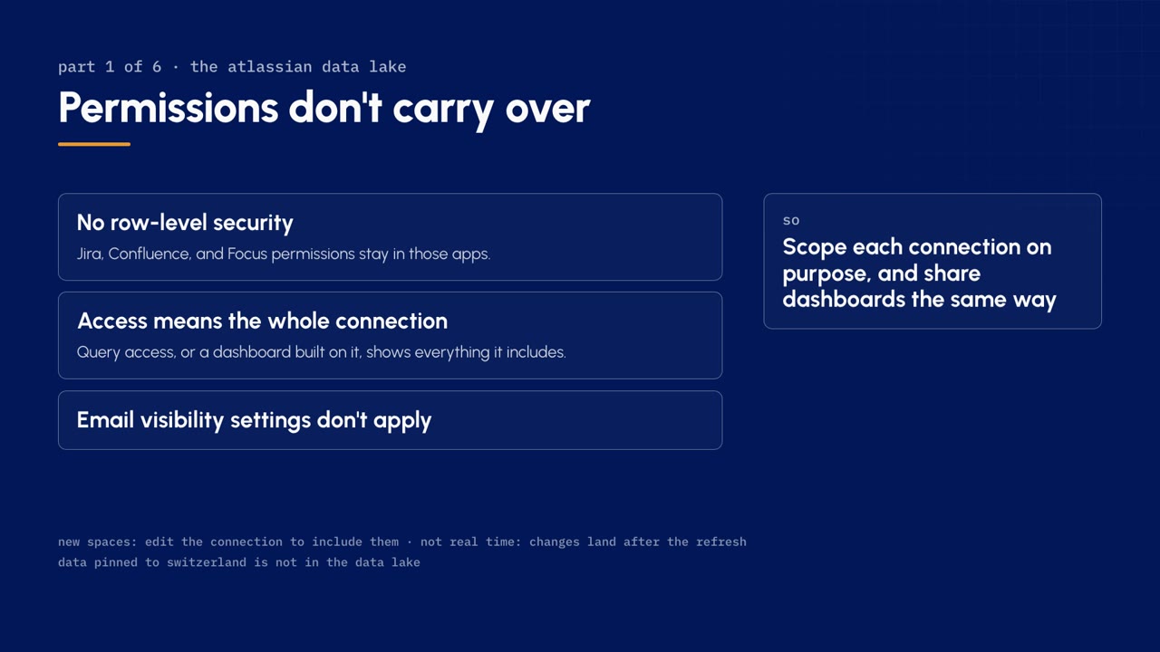
Permissions set in Jira, Confluence or Focus do not carry over to Analytics. In practice:
- There is no row-level security. A permission that hides a work item in Jira does not hide its row in Analytics.
- Access means the whole connection. Anyone who can query a connection, or view a dashboard built on it, sees everything that connection includes.
- Email visibility settings do not apply.
The connection is the permission boundary. Scope each connection on purpose, and share dashboards the same way: a dashboard's audience sees the whole connection underneath it.
Inside the chart editor
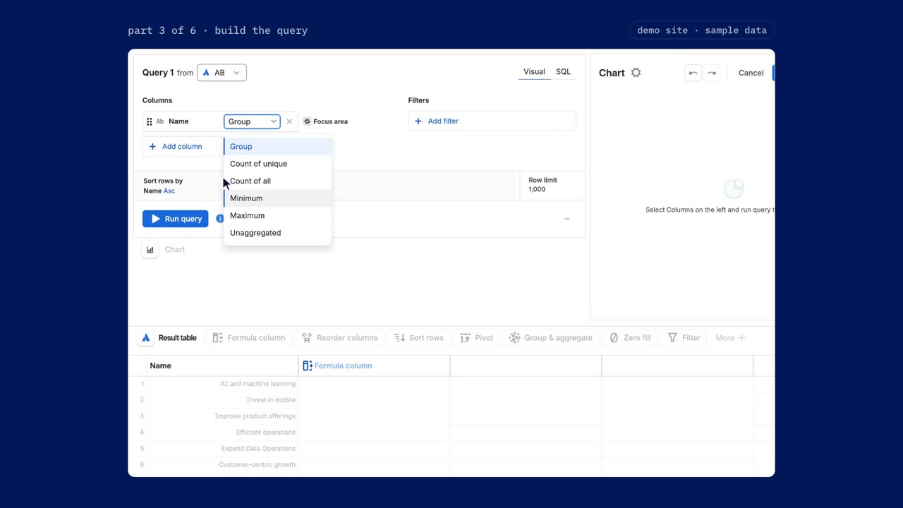
To open the editor, start on any dashboard, add a chart, and pick your Atlassian Data Lake connection. The editor has three parts:
| Where | What it is |
|---|---|
| Left | Your query: the columns, filters, sort, join path and row limit |
| Right | A live preview of the chart |
| Bottom | The result table, with the Visual SQL steps above it |
Visual mode writes the SQL for you. Switch to SQL mode whenever you would rather write it yourself.
Add column opens the schema, where tables are grouped by app. Focus tables and Talent tables sit in the same schema, so one chart can use both. Hover any table to preview its rows before you pick a column. Each column you add shows the table it comes from. For this report, the first columns are focus area name and focus area health.
Group the labels, aggregate the numbers
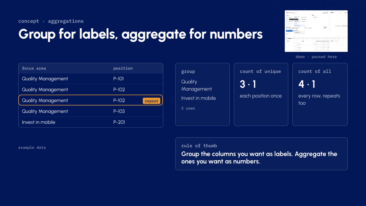
The dropdown next to each column is the most important choice in visual mode. It decides whether the column becomes a label or a number:
| Choice | What it returns |
|---|---|
| Group | One row for every unique value |
| Count of unique | The number of distinct values inside each group |
| Count of all | The number of rows inside each group, duplicates included |
| Minimum, maximum | The lowest and highest value inside each group |
| Unaggregated | Grouping off: the raw rows |
The two counts differ when a join repeats a row. The video's sample has five rows, two focus areas, and one position that appears twice:
| Focus area | Position |
|---|---|
| Quality Management | P-101 |
| Quality Management | P-102 |
| Quality Management | P-102, the repeat |
| Quality Management | P-103 |
| Invest in mobile | P-201 |
Group on focus area and you get two rows. Count of unique counts each position once: three and one. Count of all counts every row, so the repeat counts twice: four and one.
Rule of thumb. Group the columns you want as labels. Aggregate the columns you want as numbers. For positions behind each focus area: group name and health, and use count of unique on position ID.
Query filters
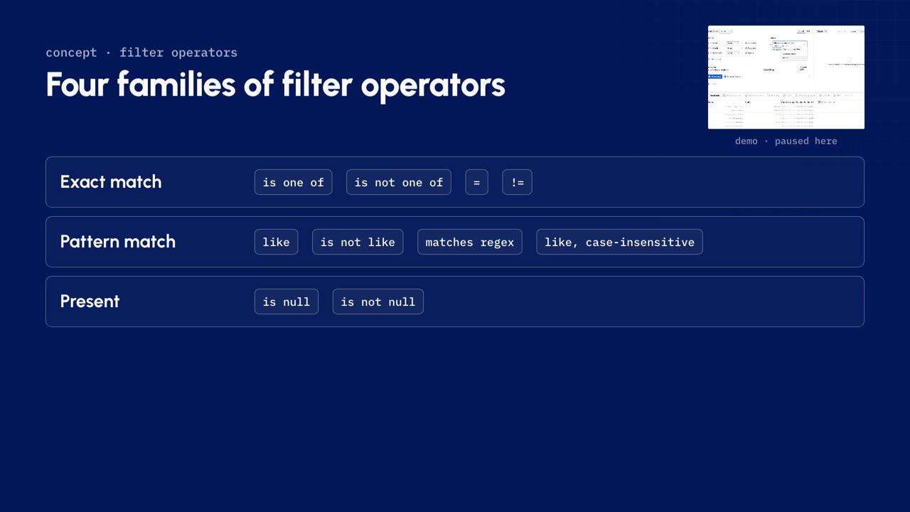
A query filter runs in the Data Lake, before anything is grouped or counted. Use it to shrink the data early. To add one:
- Pick the column, here lifecycle status.
- Pick an operator, here is one of.
- Pick the values. Analytics offers the ones it finds in your data; this report keeps active.
The operators come in four families:
| Family | Operators | Use it for |
|---|---|---|
| Exact match | is one of, is not one of, equals, not equals | Whole values |
| Pattern match | like, not like, matches regex, like case-insensitive | Finding text |
| Present | is null, is not null | Empty values |
| Relative match | greater than and the other comparisons | Numbers |
A query filter cannot see anything you calculate later. For that, see filter steps.
The join path and the generated query
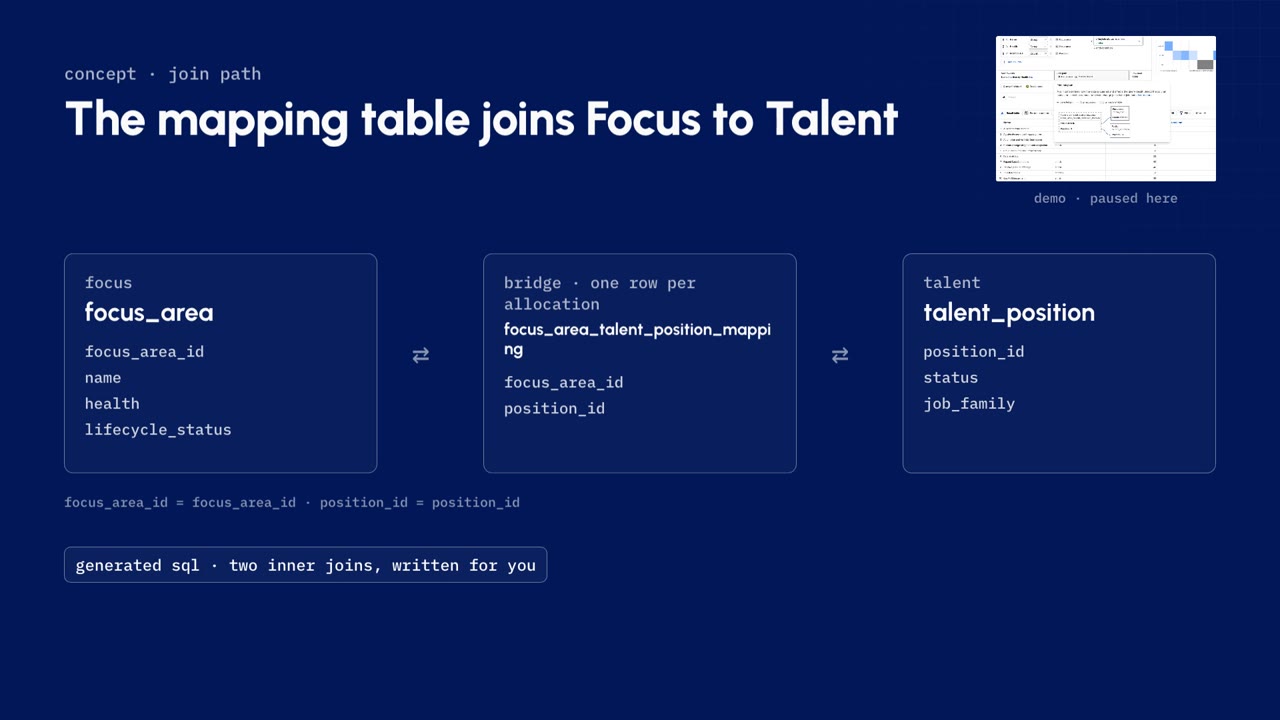
Under the columns you set the sort order, see the join path, and cap the row limit. Run the query and you get the focus areas, each with its positions counted.
Two things are worth opening on any chart, including one you inherit:
- Generated query shows the SQL visual mode wrote. It is the quickest way to check exactly what a chart does.
- Join path shows how the tables were connected. Nobody told Analytics how Focus and Talent connect: visual mode found the route on its own, from focus area, through the Talent position mapping table, to position.
| Table | From | Joined on |
|---|---|---|
| focus_area | Focus | focus_area_id |
| focus_area_talent_position_mapping | The bridge: one row per position allocated to a focus area | focus_area_id and position_id |
| talent_position | Talent | position_id |
Visual mode writes both joins for you; you only pick columns. When there is more than one way to connect two tables, the join path is where you pick the right one.
Every chart is a pipeline
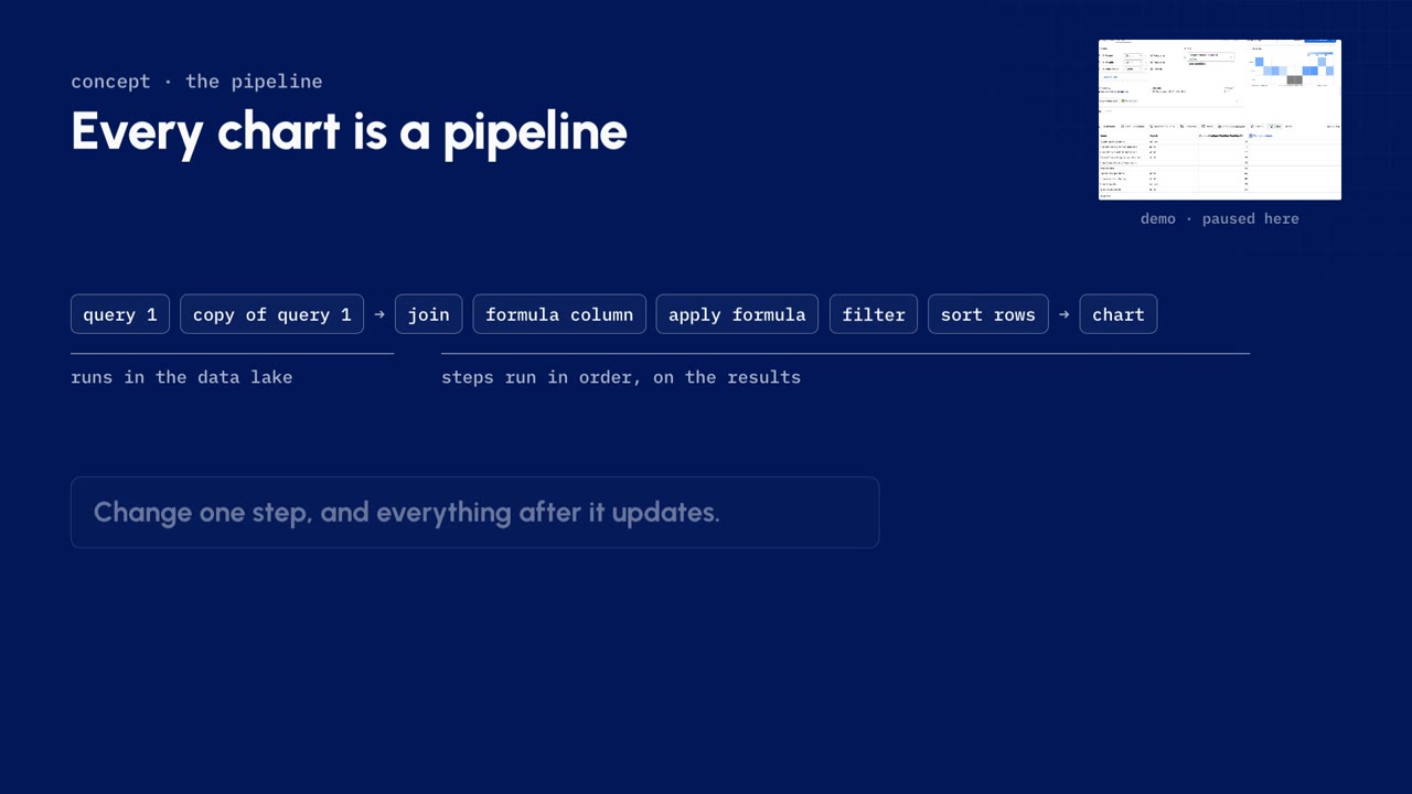
Everything below the query is a Visual SQL step. A chart runs in this order:
- The queries run first, against the Data Lake.
- Each step runs in order, on the results.
- The last result becomes the chart.
Each step appears in the pipeline on the left, so a chart is a recipe you can edit or remove one step at a time. Change one step and everything after it updates. This lesson's finished pipeline is: query one, a copy of query one, join, formula column, apply formula, filter, sort rows, then the chart.
Joining two queries
Total positions is only half the story; the report also needs the open ones. To add them:
- Choose Add query. Start fresh, or copy a query you already have.
- Copy query one, and add one filter: position status is unfilled.
- Visual SQL adds a join step to merge the two results. Columns from the second query get :1 on the end of their names, so you can tell them apart.
- Open the join step. It matches on the first column, here focus area name, and the join type decides which rows survive.
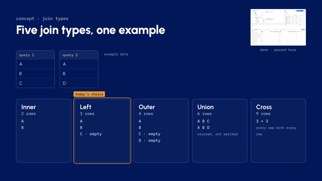
With query one returning A, B and C, and query two returning A, B and D:
| Join | What it keeps | Rows |
|---|---|---|
| Inner | Only values found in both: A, B | 2 |
| Left | Every row from the first query: A, B, and C with an empty value | 3 |
| Outer | Every value from both: A, B, C and D, with empty values where there is no match | 4 |
| Union | Both results stacked instead of matched | 6 |
| Cross | Every row paired with every row | 9 |
This report uses left: the first query leads, so every focus area stays on the list, even one with no open roles at all.
Formulas, three ways
Visual SQL calculates in three ways:
| Way | What it does | Where |
|---|---|---|
| Guided formula column | Adds a new column from a template | Formula column, then pick a formula |
| Custom formula column | Adds a new column from an expression you write | Formula column, then custom |
| Apply formula | Changes an existing column in place | Hover the column, then the function icon |
The open role rate takes two of them:
- A guided column ratio: open positions, the column ending :1, as the numerator, and total positions as the denominator.
- Apply formula on the new column, to round it to three decimal places.
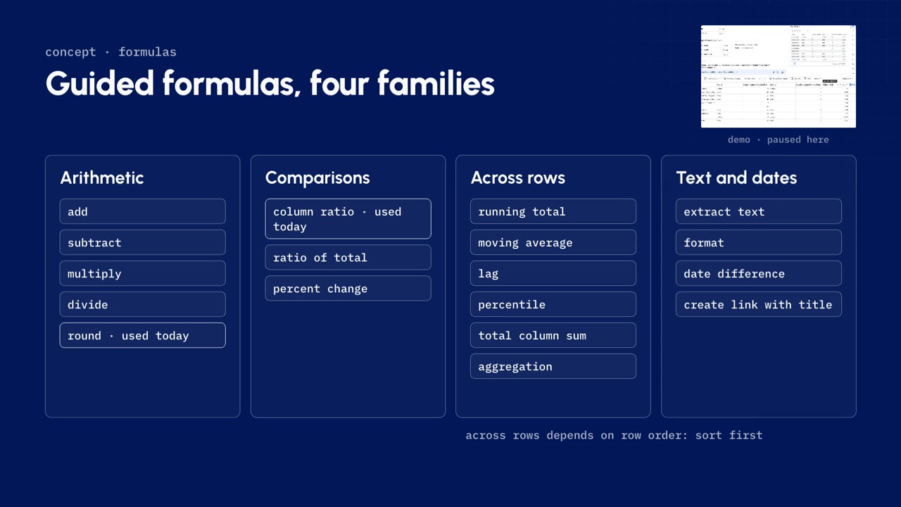
The guided formulas fall into four families:
| Family | Formulas |
|---|---|
| Arithmetic | add, subtract, multiply, divide, round |
| Comparisons | column ratio, ratio of total, percent change |
| Across rows | running total, moving average, lag, percentile, total column sum, aggregation |
| Text and dates | extract text, format, date difference, create link with title |
Watch out. The across-rows formulas depend on row order. Sort the rows before you add one.
The same hover menu hides a column or sorts it, and clicking a header renames it, so a leader can read the chart without a legend. Hidden columns still feed your formulas; they only stay out of the chart.
Filter steps
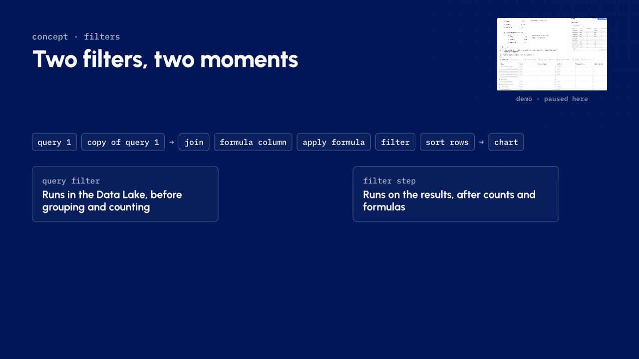
A filter step runs on the results, after the counts and the formulas. This report uses one to keep only the focus areas whose health is at risk, then a sort rows step to put the highest open role rate first.
| Query filter | Filter step | |
|---|---|---|
| Runs | In the Data Lake, before rows are grouped or counted | On the results, after counts and formulas |
| Use it to | Shrink the data early | Filter on something you calculated |
| Example | Lifecycle status is active | Open role rate above a quarter |
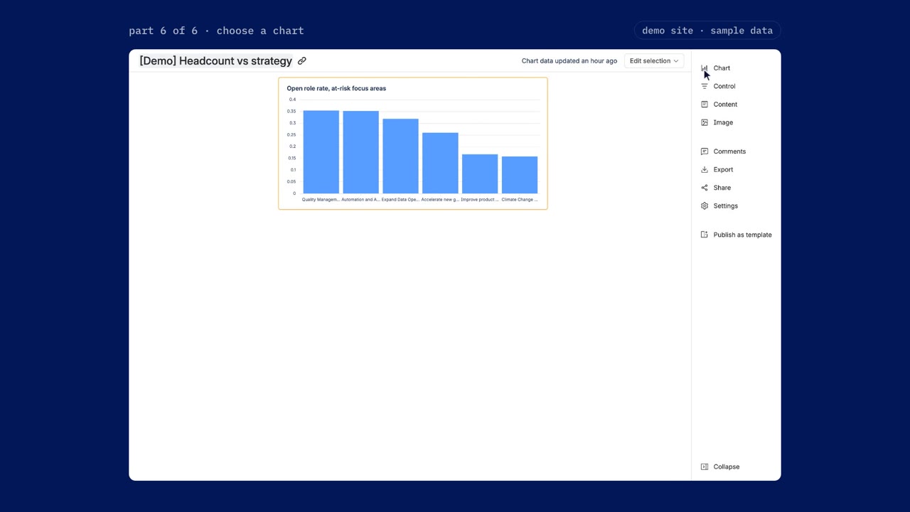
In the demo data the answer is plain: Quality Management is at risk, with twelve of its thirty-four positions still open, and four at-risk focus areas have more than a quarter of their seats open. That is the first conversation in the next portfolio review.
Picking the chart
Analytics has more than a dozen chart types. The right one depends on your question and on the shape of your result table. For most charts, the first column is the label or the x-axis, and the columns after it are the numbers. A grayed-out type does not fit your data yet: pick it anyway and Analytics shows the format it needs, or choose Auto and let it pick.
| The question | The chart |
|---|---|
| Compare categories | Bar, stacked or grouped for more than one series. Bar line adds a line on its own axis for a goal or an average |
| Two categories at once | Heat map |
| Drop-off between stages | Funnel |
| Change over time | Line. Area adds weight; percent area shows each share |
| Parts of a whole | Pie, or donut with the total in the middle |
| How two numbers relate | Scatter plot with a line of best fit. Bubble adds a third number as bubble size |
| The spread of a number | Box plot: median, quartiles, minimum and maximum |
| One number | Single value |
| One number against another | Single value indicator, with an arrow and the percent change |
| One number against goal ranges | Bullet |
| Places | Map, or bubble map |
| The raw rows | Table, with links kept clickable |
Watch out. Bar charts do not sort dates or fill in missing ones. Add a sort rows or zero fill step first.
This report compares categories, so it is a bar chart. To finish it:
- Hide the helper columns. Hidden columns still feed the formulas.
- Switch from Auto to a bar chart: open role rate for each at-risk focus area.
- Give it a title and save it to the dashboard.
Every step is saved with the chart. When Talent picks up a new hire, the numbers follow on the next data refresh without anyone rebuilding the report.
Same steps, other questions

The same handful of steps answers the questions that usually come next:
| Question | The step |
|---|---|
| Which skills does each focus area really have? | Pivot job family into columns |
| What is the contractor mix by focus area? | Filter on employment type |
| How senior is each focus area? | Group on Talent's level column |
And because every app shares the Data Lake, the same editor works across the rest of your stack: request volume by team from Jira Service Management, pages created by space in Confluence, or goals beside the projects behind them.
Check what stuck
10 questions on this lesson. Pick an answer to see whether it is right, and why. Nothing is sent anywhere and there is nothing to sign up for.
Who teaches it

Riley Venable
VP of Services, Atlas Bench
Full-stack engineer, Atlassian Certified Instructor, and Atlassian Community Champion who works on the layer underneath the tools: identity, infrastructure, and the systems that decide whether AI can be trusted with them.
Keep going
Atlassian Analytics essentials
A free, self-paced course on Atlassian Analytics: how the Atlassian Data Lake is connected and secured, and how to build a real report in the visual editor without writing SQL. Each lesson is a short video with the concepts written out beside it and a quiz to check what stuck.
ServiceStrategic reporting and budgets
Strategy Collection, Jira Align, and scaled agile, for the executive who has to defend the spend.
ProductStrategy Collection
What Atlas Bench does with the Atlassian Strategy Collection: standing up Focus and Talent, modeling value streams, and a portfolio roll-up kept live.
ProductAtlassian Analytics
What Atlas Bench does with Atlassian Analytics: data modeling, traceable reporting, and the standardization that has to happen first.
ProductFocus
What Atlas Bench does with Atlassian Focus: modeling focus areas to value streams, intake, and connecting delivery so the roll-up is live.
ProductTalent
What Atlas Bench does with Atlassian Talent: standing up the workforce model alongside focus areas so capacity and priority sit together.