

All the New Changes to Atlassian's Product Navigation
Atlassian changes the navigation in Jira, Confluence and JSM making consistent user experience in cloud products.

Overview of the reimagined Atlassian navigation experience
Atlassian has rolled out a sweeping redesign of its product navigation, aimed at making it easier for every user to move around Jira, Confluence, and other Atlassian cloud products. This reimagined navigation experience is more intuitive and flexible than before, reflecting Atlassian’s mission to streamline how teams work across their tools. It introduces a familiar modern interface that will eventually unify navigation across all Atlassian products. As an Atlassian Solution Partner, Atlas Bench recognizes that this update is a major usability improvement that will benefit end users, team leads, and IT administrators alike.
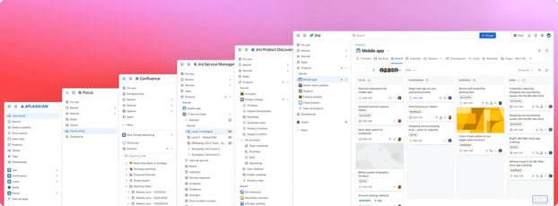
What’s new: Top navigation, sidebar, and modern design updates
-
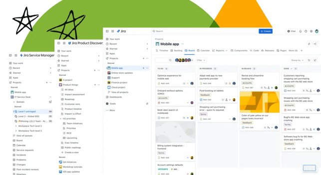
Simplified top navigation: Atlassian has decluttered the top bar to focus on the essentials. A prominent global search lets you quickly find issues, pages, or projects from anywhere, and a single Create button is always at hand for adding new work. Meanwhile, utility icons for notifications, settings, and your profile are still easily accessible, just without the previous clutter.
-
Personalized sidebar: A new left-hand sidebar highlights the most important destinations and lets you customize what you see. You can choose which items (like projects, spaces, or filters) to show or hide and even drag to reorder them. If you need more screen space, the sidebar can be resized or collapsed entirely, and you can always expand it again with a quick click (or keyboard shortcut) when it’s time to navigate. Each user’s sidebar setup is personal, so you can tailor your navigation without affecting others on your team.
-
Modern, scalable design: The interface now sports updated colors, icons, and typography aligned with Atlassian’s latest design language. The look-and-feel is cleaner and more consistent, improving readability and accessibility. This modern design isn’t just about aesthetics; it’s built to scale with your organization. Whether your team is small or growing large, the navigation will remain clear and efficient as more projects and content are added over time.
Where it’s rolling out (Jira, JSM, JPD, Confluence, Atlassian Home)
-
Jira: The new navigation experience is being applied to Jira Software Cloud, bringing a consistent UI for software development teams. Navigation within and between projects, boards, and filters is now done through the universal sidebar and top bar, so Jira users will notice a cleaner look immediately.
-
Jira Service Management (JSM): JSM, Atlassian’s IT service desk product, is also receiving the new navigation. Agents and help desk teams will find the interface familiar if they use Jira, with the same top menu and sidebar making it easier to switch contexts between service projects and other work.
-
Jira Product Discovery (JPD): Atlassian’s newer product for idea tracking and product management, Jira Product Discovery, is included in this navigation update as well. This ensures product managers and stakeholders using JPD get the same modern navigation framework, aligning it with the rest of the Jira family.
-
Confluence: The popular wiki and knowledge base tool Confluence is adopting the reimagined navigation, too. Confluence Cloud will now have the unified top navigation and customizable sidebar, making it simpler to jump between spaces or find recently viewed pages. Users moving between Confluence and Jira will have a more seamless experience with consistent menus across the two.
-
Atlassian Home: Even the Atlassian Cloud home page (the central landing hub for all your Atlassian apps) is refreshed with the new navigation. Atlassian Home’s navigation lets you access recent projects, spaces, and tasks across Jira and Confluence from one place, using the same design language for a smooth cross-product journey. No matter which product you start from, Atlassian Home ties it all together with the new nav system.
Timeline: From internal testing to Early Access to GA
This navigation overhaul has been in the works for well over a year, undergoing multiple rollout phases before reaching all customers. Atlassian began with internal testing in mid-2024, having its own employees (“Atlassians”) use the new nav in their daily work to gather feedback and fix issues. By October 2024, Atlassian launched an Early Access Program (EAP) for around 100 select customer organizations to try the new navigation. Feedback from the EAP was very positive: Atlassian noted an opt-out rate of only about 2.7%, meaning the vast majority stuck with the new UI. Encouraged by these results, Atlassian opened a public beta phase later in 2024, allowing any interested cloud customer to opt in (and even making the new nav the default for all new sign-ups). After several months of refinement and seeing continued strong adoption, Atlassian moved to General Availability (GA) in early 2025. As of March 17, 2025, the new navigation began rolling out to all cloud users in phases. The rollout is gradual, happening in waves over a few months, to ensure stability and give admins time to prepare. Now in April 2025, many Jira and Confluence sites have the new navigation enabled or imminent, and Atlassian plans to have it across Standard, Premium, and Enterprise cloud editions shortly.
Benefits for users: Simpler experience, better customization, more consistency
-
Streamlined experience: The redesigned navigation makes everyday use simpler. Users spend less time clicking around menus or hunting for pages, and more time getting work done. With a cleaner interface and key functions like search front-and-center, even new users can quickly find their way.
-
Customized to your needs: Every user can adjust the sidebar to include the projects, queues, or pages they care about most. By pinning favorite items and hiding those you rarely use, your navigation truly reflects your day-to-day priorities. This level of personalization means team members in different roles (developers, support agents, managers, etc.) can each craft a navigation that makes them most productive.
-
Consistent across tools: A major pain point for many teams has been the inconsistent look and navigation between Atlassian products. Now, Jira and Confluence (and others) share the same structural navigation. This consistency reduces the learning curve when moving between tools: if you know how to navigate one, you can navigate the others. Team leads and project managers will appreciate that onboarding users to multiple Atlassian apps is easier with a unified UX.
-
Future-proof and scalable: Atlassian’s modernized navigation isn’t just about the present; it’s built for the future. The new design improves accessibility (better contrast, clearer fonts) and lays a foundation that can accommodate new features or additional products without confusion. As your organization grows, the navigation will scale gracefully, maintaining performance and clarity even as the number of projects or spaces increases.
Admin controls for phased adoption and Sandbox testing
Administrators are given ample control and flexibility to manage this change. Atlassian knows that UI changes can be disruptive, so they’ve provided admin features to roll out the new navigation at a comfortable pace. First, admins can try the new navigation just for themselves (via the Jira Labs settings, for example) without affecting anyone else. This allows IT teams and product owners to evaluate the changes internally and prepare training or documentation. When ready, admins can then enable the new navigation for all users on their site with a single toggle. (If an admin takes no action, Atlassian will automatically switch the site to the new UI a few weeks after the feature becomes available, ensuring no one misses out.) During an initial period after enabling, end users still have the ability to switch back to the old navigation if they need to, giving teams a short adjustment window. In addition, Atlassian has made the new navigation available in Sandbox environments for enterprise customers. This means you can test the new interface in a non-production sandbox site, allowing power users and stakeholders to play with the changes and iron out any questions before rolling it out company-wide. These admin controls, from previewing it yourself to sandbox testing, ensure that the transition to the new navigation can be as smooth and well-coordinated as possible. Atlas Bench recommends taking advantage of these options so your team is fully comfortable with the new experience by the time it becomes permanent.
Read next.
Change Management in Jira Service Management: A Guide
See how to manage organizational change effectively with Jira Service Management, using proven strategies for lasting adoption across teams
April 16, 2026New Work Types in Jira Business Spaces
Learn how Jira's new work type hierarchy in business spaces gives non-technical teams better structure, and control over their work.
April 16, 2026Web Search in Rovo Agents: What It Is and How to Use It
See how web search in Rovo Agents works, how to set it up, and how teams are using it to bring live web context into their workflows.
April 13, 2026Real-Time Use Cases of Rovo AI in Jira and JSM
See how Atlassian Rovo is changing the way teams work in Jira and JSM in real time.
The blog, weekly.
One email a week with what we published. No drip sequence, and you can leave in a click.